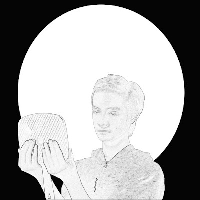
For this project, we had to take self portrait photos and digitally edit them to look like an art style of our choice. The art style I selected is Art Nouveau.
During the editing phase, I applied a filter that gave outlines to myself and the mirror. This matches the art nouveau art style, as almost everything has an outline. The background is going to have the four corners highlighted by triangles while the white circle is going to also have designs and colours added to it. I would have done this digitally, however I ran out of time.
I started by having Ruben take pictures of me under a loop lighting. I positioned myself to be looking into a mirror, but still leaving the front of my body visible. Next, I took it into photoshop and used a quick selection tool to cut myself out of the photo. I made a black background with a white circle over top of it. This would act as a template for my background. After that, I dragged myself into the background image and began doing some touch-ups to my face. Once I was satisfied with it, I made the image greyscale. This was because without doing so, the filter I wished to apply next looked weird. I then applied a filter that gave me and the mirror a bold outline to match the art nouveau style.
I'm not too satisfied with it at the moment, but I feel like I'm going to like it a lot more once I paint over it.
The Endless Void of Drawings & Nonsense
Friday 28 April 2017
Tuesday 11 April 2017
Still Life Sketch
For the past two weeks, we've been working on some still life drawings. We had an arrangement of items ranging from small statues to flowers to skulls. We were tasked to focus on one are of the entire set up and sketch out the objects we saw. For my sketch, I decided to focus on two vines of flowers and a skull. Here is how the finished product turned out.
I started by doing some rough sketches on newsprint paper until I was satisfied with my composition. Next, I moved on to the larger, better quality paper. I began roughing out the shapes of the skull the vines and the flowers very lightly. Then, I continued sketching lightly and begun fleshing out the contour of the objects. I continued to do this, getting more and more details in as I progressed. Once I was happy with the outline, I decided to start shading everything in. It got a bit tricky in the super dark areas, and I had to be careful that the flower stem didn't completely merge with the dark parts of the skull. Once I had everything shaded, I added in the folds of the fabric to balance is all out.
For this drawing, I decided to go with an "L Composition". I accomplished this by focusing on one of the flower vines hanging down from the left, and having it intersect the other flower vine. The second flower vine went horizontally and passed in front of the skull. The flowers acted as the base for the "L" shape while the skull helped weigh it down. I also used the background to help put together my composition by placing shadows. There are four shadows in the area of focus. The large shadow on the left, the shadow beneath the skull, and the shadows cast by the flowers. I did add some folds to the negative space, but I made sure that they didn't take away from the overall piece.
Tuesday 14 February 2017
Understanding Shutter Speed, Aperture and ISO
Low Shutter Speed
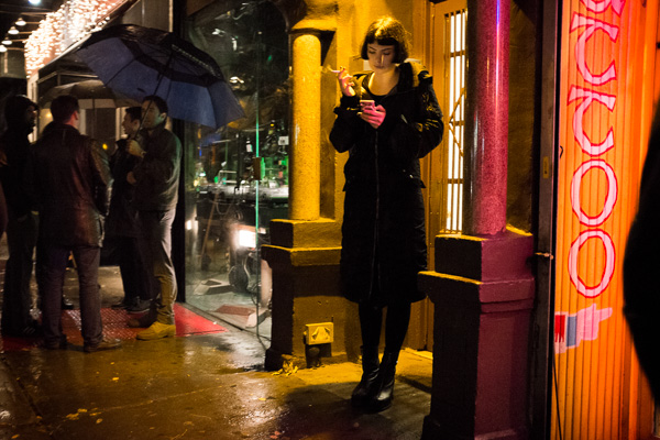
These two photos show a make for a good example of low shutter speed because both of the subjects are completely blurred with any sort of movement, including the woman who's just walking.
High Shutter Speed
For the high shutter speed examples, I chose a photo of a hummingbird mid flight and a photo of a bullet being shot through several balls of Play-Doh. These provide good examples of using high shutter speed to completely freeze any and all action in a scenario because of the speed at which the subjects were moving when these photos were captured. For instance, hummingbirds flap their wings 10-15 times per second, a speed which the human eye would perceive as a blur. However, using a high enough shutter speed, you're able to capture these wings as though they weren't moving at all.
Low Aperture
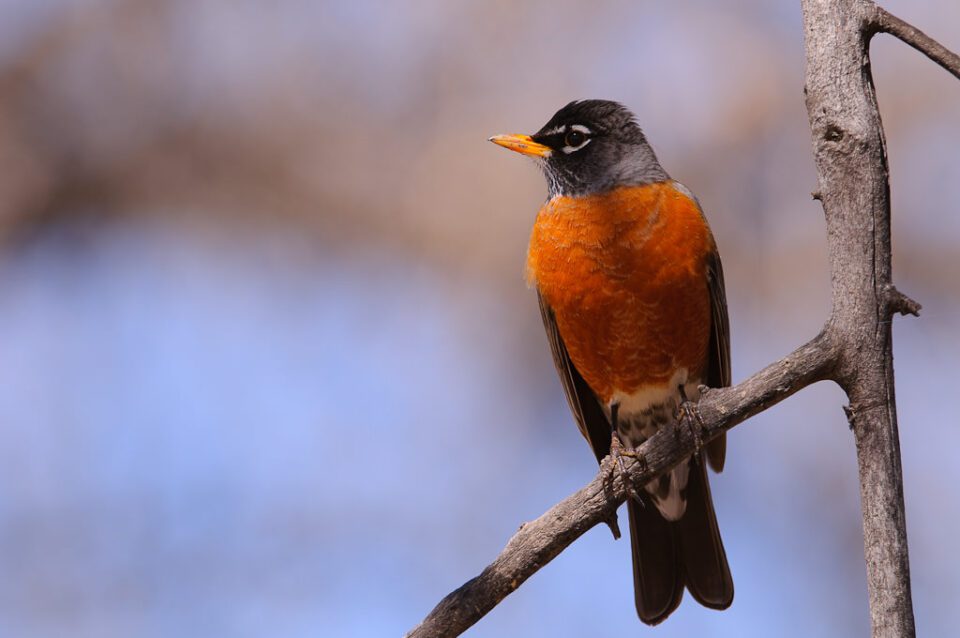
These photos demonstrate low aperture because the only thing in focus is the subject.
High ISO
In these pictures the area surrounding the subject is quite noisy and everything looks very bright
Low ISO
In these two images, the area surrounding the subject are much clearer and quieter, however the images aren't quite as bright.
Monday 13 February 2017
Friday 18 December 2015
Digital Surrealism
The concept for my digital surrealism was to display the
different sides of our personalities that don’t always show. I was trying to
explain how sometimes we don’t show our true selves and how we act differently
& alter our personality and our actions based on our audience and our
surroundings. That our true selves are rarely shown or seen. I portrayed this
by taking multiple shots of me in different positions and outfits doing
different things. Each variant signified an alteration or piece of my overall
personality. One was on the floor, laying belly down watching TV. That one is
the “Core Persona”. Being the main part of my overall personality, he’s wearing
simple street clothes. I figured the aspects he would represent would be things
related to my most notable traits, such as humor, etiquette, and my mostly
relaxed nature. There were two other copies of me representing the other parts
of my personality that wouldn’t really be noticeable just by looking at me.
I started out by sketching the
birds-eye-view of my living room layout so I could determine where to position
myself and where to position the camera. I decided on placing my camera on a tripod
beneath and arc like entryway that leads to my living room. I set the camera to
the 10-second countdown mode. I would then get in position and wait for the
camera to take the picture. Once the picture is taken I would go over to see it
and check if I needed to alter the environment in terms of lighting and stuff.
Once I got all the pictures I started working in Photoshop. I used a picture of
just my living room as my background and I altered the brightness and contrast
because it looked a little dark. Next I started dragging in the pictures of
myself and editing them out of their original pictures and putting them onto
the background. After all of the Josh Variants were in I also inserted my cat
into the picture just for fun.
Throughout this project I learned
a lot more about layering, changing things like brightness and contrast, and I
also learned how to use opacity. I’m pretty satisfied with how the end product
turned out. It didn’t end up exactly how I imagined it but I’m still happy
about how it looked in the end.
Thursday 5 November 2015
Inuit Throat Singing Girls at Trudeau's Swearing in Ceremony.
During Justin Trudeau's ceremony of getting sworn in as prime minister, two young inuit girls did a throat singing presentation. How it works is they stand face to face, link arms, stare into each others eyes and begin throat singing. Similarly to a staring contest, where the first person to blink loses, whichever girl laughs first loses that round.
http://www.cbc.ca/news/canada/north/inuit-throatsingers-steal-the-show-at-justin-trudeau-s-swearing-in-ceremony-1.3304148
Fire and Storm Transformed
By Fire and Storm Transformed
Created by: Aaron Paquette
This picture is of a tall woman in a flowing red dress getting struck by lightning. I am uncertain as to what the artist used to make this. The lines in this picture are arced and wavy along with the jagged lines used for the lightning and the electricity. There is also a lot of oval like shapes. The colours in this picture are bright and vibrant. The woman has a warm colour scheme of red yellow and a hint of orange, where the background has a cool colour and grey colour scheme going on.
The first thing you see upon looking at this picture is the red dress because of how bright and vibrant it is against the grey background.The next thing you notice is the bright white lightning. The light is coming from the lightning and the darker parts of the picture is closer to the bottom. This picture is nothing but flat space and it would be symmetrical if it weren't for the lightning.
Subscribe to:
Posts (Atom)